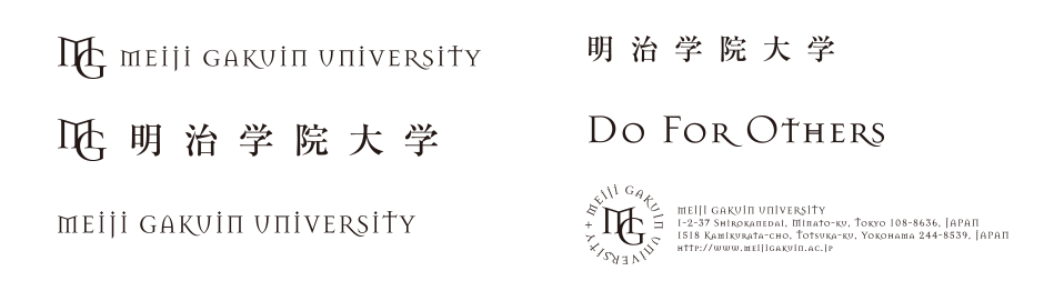
Logo Mark of Meiji Gakuin University

The branding project was launched in 2004 with a view toward heightening the brand value of Meiji Gakuin University by showing the excellent aspects of the university to society. Then, in 2005, a new logo mark and school color were adopted. They serve as an icon to clearly show society our educational philosophy of “Do for Others.”

Symbol Logo
The symbol logo serves as an icon representing the university. The symbol logo of Meiji Gakuin University incorporates the letters M and G for Meiji Gakuin. It is a visual expression of the image of the university.
Symbol Logo
A form in which the “MG” symbol logo is surrounded by the words “Meiji Gakuin University” results in a mark that can easily be used in all sorts of places.

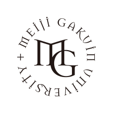
Corporate Color
Like the symbol logo, the corporate color is an essential chromatic element that helps convey the image of the university. Meiji Gakuin University has chosen yellow (Y100 = yellow 100%) to symbolize “the light that illuminates people and society,” which arises from our educational philosophy of “Do for Others.”
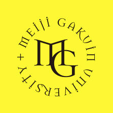
Corporate Color + Symbol Logo
The corporate color is used in combination with the symbol logo. This clearly establishes the image of the university.
Logotype
The logotype consists of stylized letters. Meiji Gakuin University uses the same font for the symbol logo to present a unified image. The logotype retains the image of the symbol when it is used on its own.